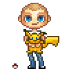
ShopDreamUp AI ArtDreamUp
The new "nickelodeon" logo is... --> http://www.underconsideration.com/brandnew/archives/nick_nickelodeon_logo.gif
194 votes
gorgeous!
so-so...
horrible.
Deviation Actions
Are you getting Zelda: Tears of the Kingdom?
| 18 votes
- Heck yeah!
- Probably not…
- Maybe later.
Did you get the Happy Home Paradise DLC for Animal Cros...
| 29 votes
 Yes!
Yes!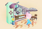 Newp…
Newp…
How excited are you for Animal Crossing: New Horizons?
| 41 votes
- I've been screaming in animalese for months!
- Tom Nook owns my soul.

- omg terraforming…

- I don't own a switch but I may just get one.

- What even are animals and what are they crossing?

- Other: Comment Below
Comments95
Join the community to add your comment. Already a deviant? Log In
I love it! 